Google’s (for now) Novel Approach to “Must Read” Instructions
Google is making sure people understand the implications of using multiple Google accounts before enabling this feature.
Web users scan your text, skip paragraphs, click the button that looks like the ‘next’ button, decide whether to stay on your site (or not) within seconds, close anything that resembles a pop-up, and don’t read instructions.
This introduce an interesting dilemma when designing user interfaces for web applications: What do you do if you absolutely must pass on highly critical information to your users?
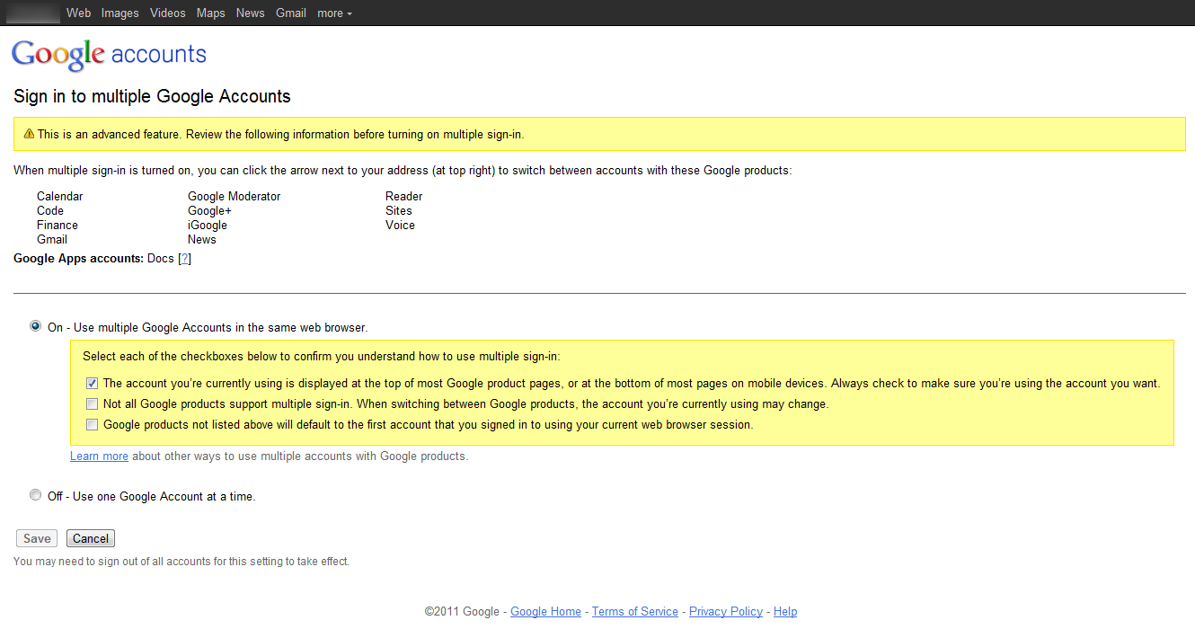
Here’s how Google do it when you activate “Sign In to Multiple Google Accounts”:
Google asks you to confirm each of these three implications of using ‘Sign In To Multiple Google Accounts’.
Instead of the widely used “I Accept / Understand” checkbox (typically seen for accepting Terms of Service when creating an account), Google takes it one step further by cutting the critical part of the message down to 3 separate ultra short descriptions, each of them with its own checkbox the user has to click before the “Save” button is enabled.
In more general terms this is just another pit stop in the never-ending spiral of attention slip. As this solution gains traction, it’s only a matter of time before some websites will start “abusing” the approach, using it for non-critical instructions and sales messages. After a while, users will grow accustomed to this configuration and will eventually afford it the same (extremely low) level of attention they afford “Accept terms” checkboxes nowadays.
For now, however, the approach is novel and well-designed.
User experience research, delivered twice a month
Join 25,000+ readers and get Baymard’s research articles by RSS feed or
Topics include user experience, web design, and e-commerce
Articles are always delivered ad-free and in their full length
1-click unsubscribe at any time
Related Articles
More E-Commerce Research
Free Research Content:
- Popular Articles · a listing of our most popular research-based articles on e-commerce UX
- UX Benchmark · benchmark with case studies of 93 major e-commerce sites ranked by e-commerce UX performance
- Page Designs · navigate 8,400+ manually annotated full-page screenshots categorized by page type
Products & Services:
- Baymard Premium · full access to all 582 research-based design guidelines, UX case studies, page designs, and review tool ($720-$3,000 / year, based on plan)
- UX Audit · get an in-depth analysis of your site’s UX, conducted by a Baymard researcher ($1,900-$9,700 based on scope)
Comments
© 2021 Baymard Institute US: +1 (315) 216-7151 EU: +45 3696 9567 info@baymard.com


MattSeptember 21, 2011
This great post is sorely in need of editing. Several errors per paragraph. Subject-verb agreement. It’s is a contraction, not a possessive pronoun. Should be “an interesting,” instead of “a interesting” and the list goes on. This is basic stuff, guys. But I still enjoyed the point you made and thank you for it.
Jamie, Baymard InstituteSeptember 22, 2011
Hi Matt,
Thanks for the heads-up. Just ran through the post and did a bunch of edits.
While we’ve never been perfect at grammar (and probably never will be), this was way below our standard and I do apologize for that. We’ll be sure to pay more attention to this.
JaredNovember 10, 2011
People don’t read instructions because most instructions are too long and aren’t scannable. Make instructions more scannable by having brief, but descriptive titles and section headers with good visual contrast (large, bold, different color), short lists/list items, and clear call-to-action sections.
DamianMarch 22, 2012
Well stated, but I would format it this way:
People don’t read instructions because:
– most instructions too long
– Not scannable.
Make instructions more scannable by:
=========
– brief title use
– descriptive titles required
– section headers
– good visual contrast
- LARGE,<b>bold, </b>-
— different color),
– short lists/
– Short list items,
– CLEAR CALL-TO-ACTON sections.
We all get trained in how to most effectively scan and read vast amounts of information. The key seems to be to figure out what are the important pieces of the whole that we need to pay attention to.