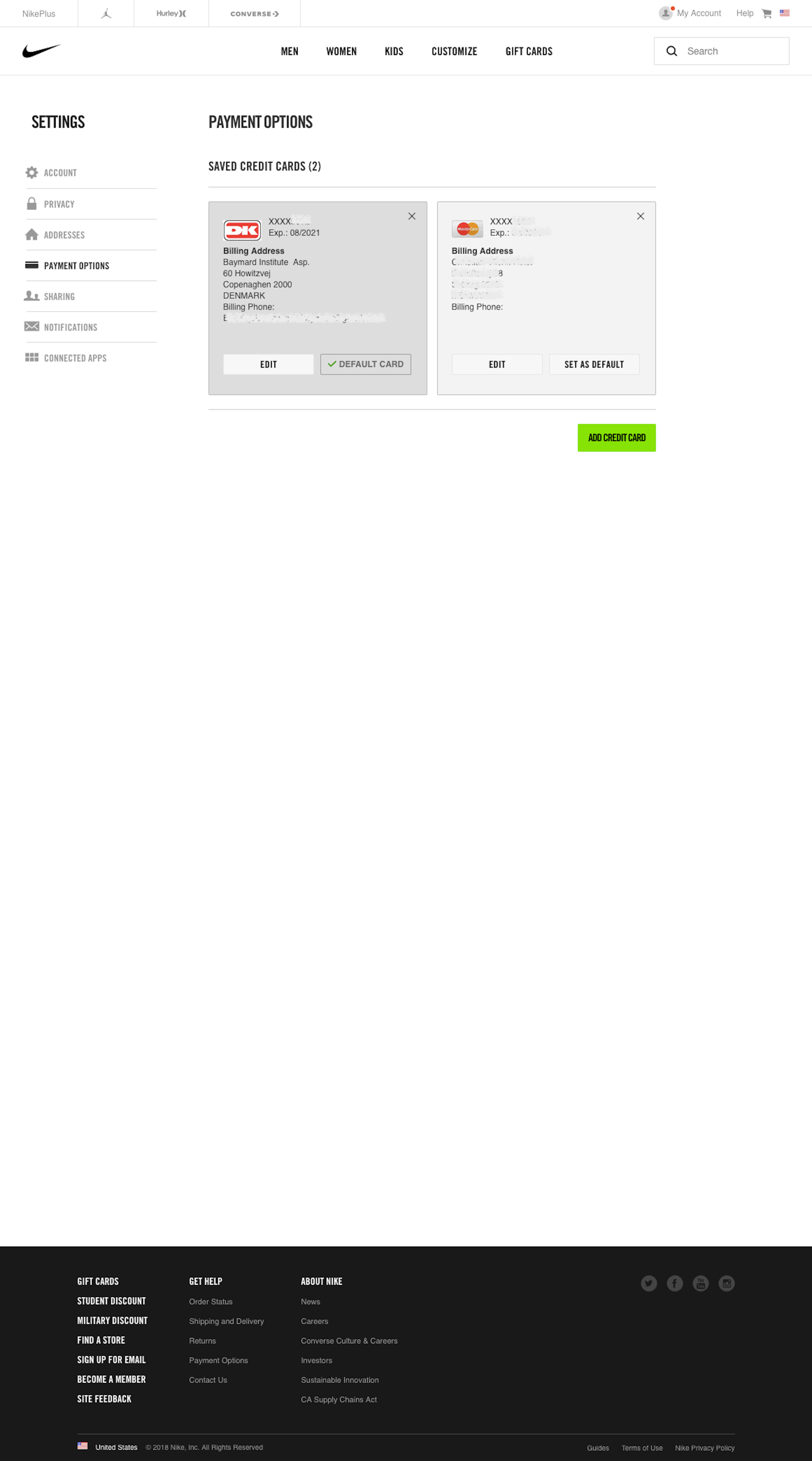
On this page there’s 2 highlights (premium only) outlining what Nike are doing right and wrong. (Tip: use the arrows above or on your keyboard to navigate all 373 ‘Stored Credit Cards’ annotated design examples.)
The screenshot was taken on December 24, 2018 and depicts Nike’s Stored Credit Cards. In total, we’ve reviewed 98 of Nike’s page designs. To see them all, visit the full Nike UX case study.