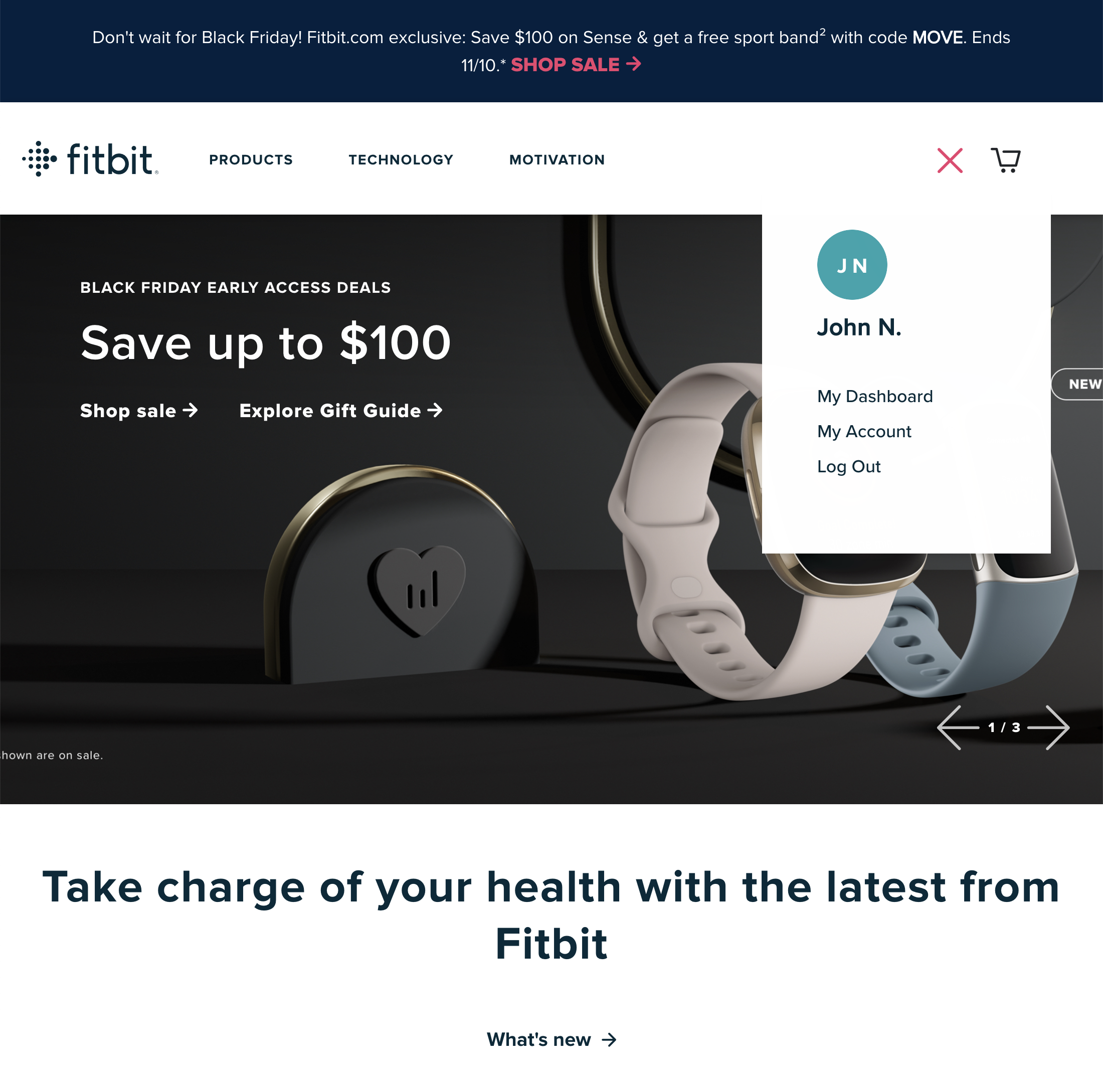
On this page there’s 8 highlights (premium only) outlining what Fitbit are doing right and wrong. (Tip: use the arrows above or on your keyboard to navigate all 401 ‘‘My Account’ Drop-Down’ annotated design examples.)
The screenshot was taken on November 7, 2021 and depicts Fitbit’s ‘My Account’ Drop-Down. In total, we’ve reviewed 25 of Fitbit’s page designs. To see them all, visit the full Fitbit UX case study.